Dealer:
American Wood Reface – Medina, Ohio
Project Location:
Fairlawn, OH
Project Scope:
An awkward L-shaped wall dominated and closed off this kitchen from the rest of the home. In addition, the layout of the cabinets and appliances wasn’t utilizing the kitchen’s full potential. In order to give this family the functional and updated kitchen they wanted, we’d have to reconfigure the space.
Project Solution:
Layout
The first thing we wanted to tackle was getting the L-shaped wall removed and out of the way to start opening up the space. We then rebuilt all the cabinet boxes to create a different configuration that includes a pantry, angled drawer banks to replace a blind corner cabinet, and space for the homeowners’ brand new french door refrigerator.
Island
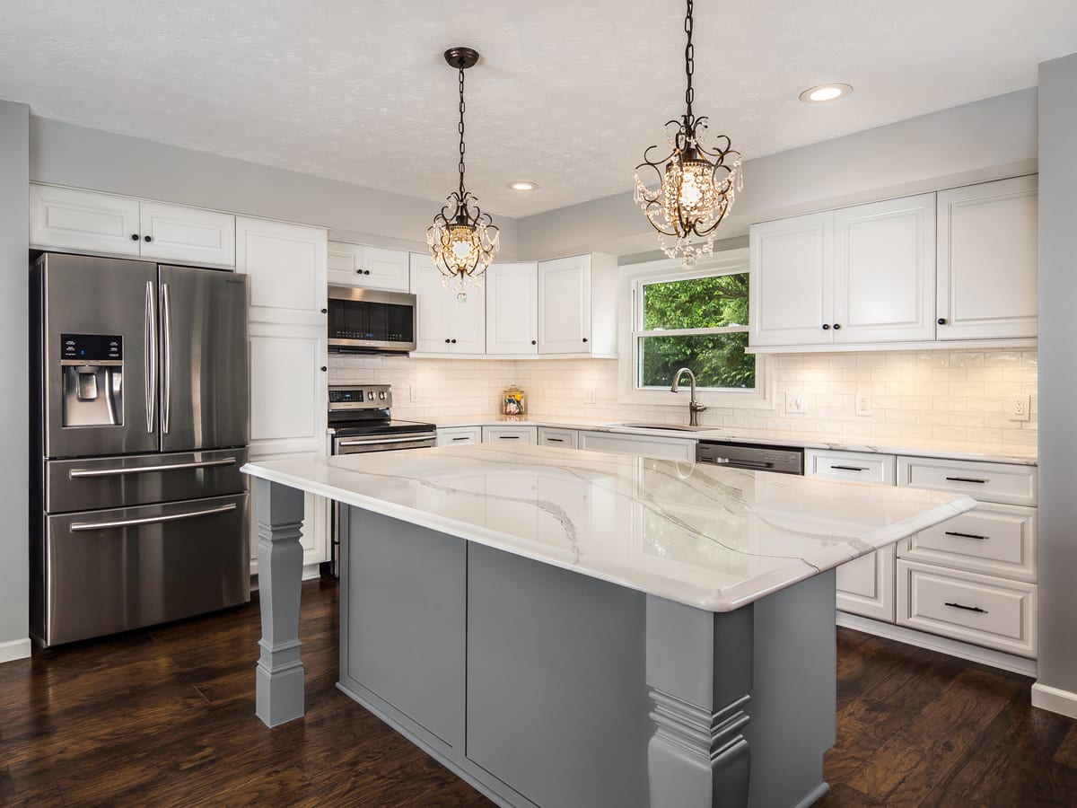
We constructed a new island that offers plenty of counter and storage space while still keeping the room open—as opposed to the encapsulating L-shaped wall that existed previously. What makes this island unique are the turned wooden posts on each outer-facing corner. They help give the island a stylized look so that it seems like a large piece of furniture that makes a big statement in the kitchen. In order to set the island apart from the rest of the cabinetry, our customer wanted to go with Cityscape, a beautiful gray color that contrasts nicely with the Ballet White perimeter cabinets.
Cabinetry
The custom-built cabinets were refaced in Ballet White solid birch that offers a high-quality, durable finish, and cabinets and drawers were given new square, Ogee Frame, raised doors and drawer fronts that offer an updated look while still staying true to the family’s traditional style.
Countertops & Backsplash
In order to continue to the light and bright look the family was going for, we topped both the perimeter cabinets and the large island with Cambria quartz in Britannica, and we installed a cloudy white, glossy subway tile backsplash that’s complemented with under cabinet lighting that bounces elegantly off the tile and countertops. All of these white elements work nicely with the dark wood floors to create a fresh and crisp design.
Additional Details
Beyond the major upgrades to the overall layout and to the cabinets and countertops, the small details are what give the kitchen its unique flair that really shows off the style of the homeowners. Contrasting hardware provides just the right “pop” against the white and gray cabinetry, and the chandeliers above the island and over the dining table provide a dainty and glitzy aspect that makes the whole room dazzle.
But of course it’s not just about the looks! We were able to give this family a kitchen full of high-quality cabinetry and surfaces that are durable and that will better withstand the wear and tear of everyday life, while also transforming an awkward and closed-off layout into something that makes sense for the family and offers increased storage space.
Project Highlight:
This kitchen started out with a lazy susan as a solution to a blind corner, but it just wasn’t the best use of space and our client wanted a more modern and accessible solution. We converted this corner cabinet lazy susan into an angled drawer bank for fully accessible storage. Learn more about other possible solutions to blind corner cabinets.

